Affiliate links may be used in this post, which means I'll receive a small commission if you purchase through my link. There is no additional cost to you. You can read the full disclosure here.
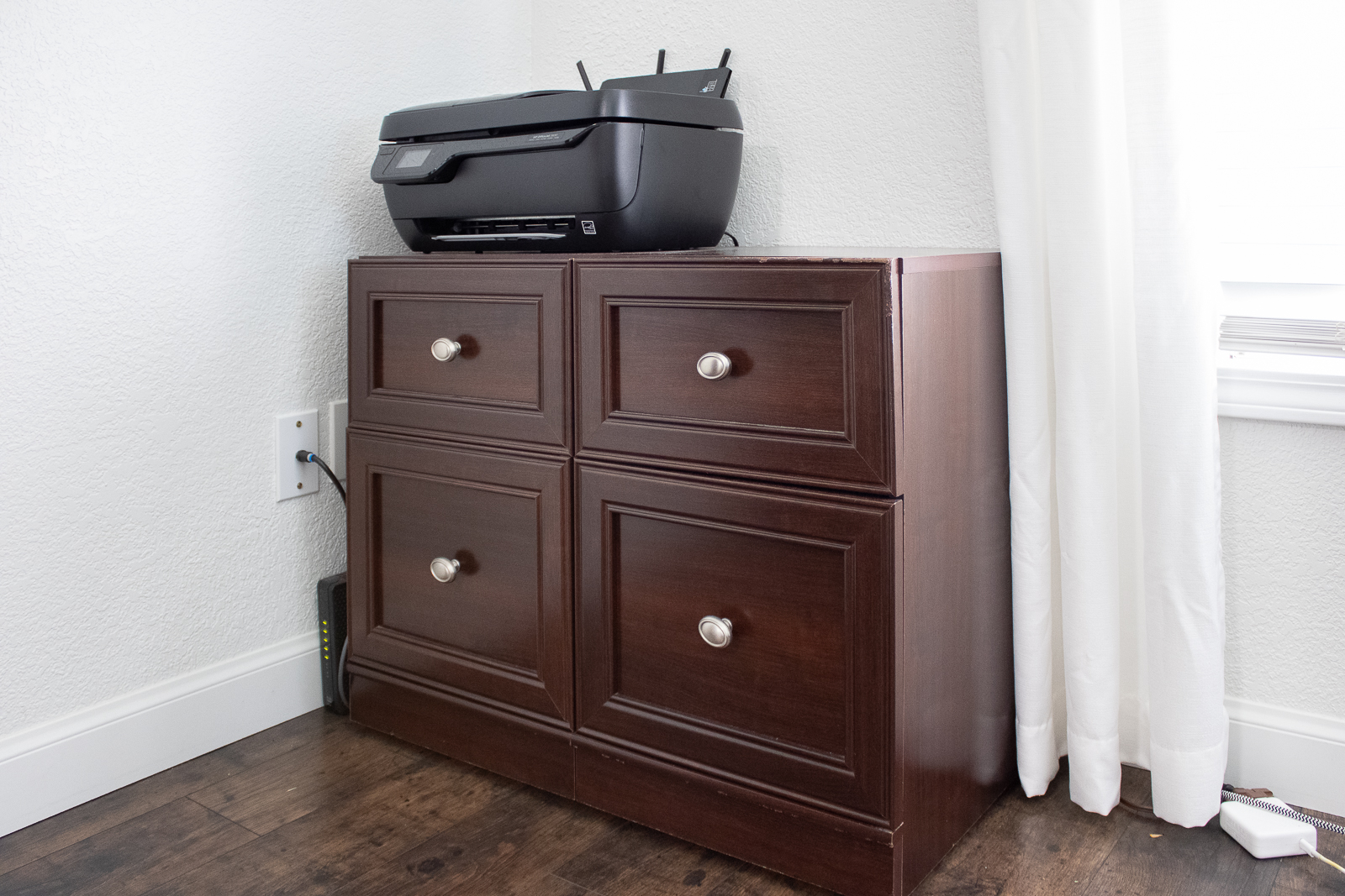
Before we get to the pretty photos and final reveal, let's see what was before.
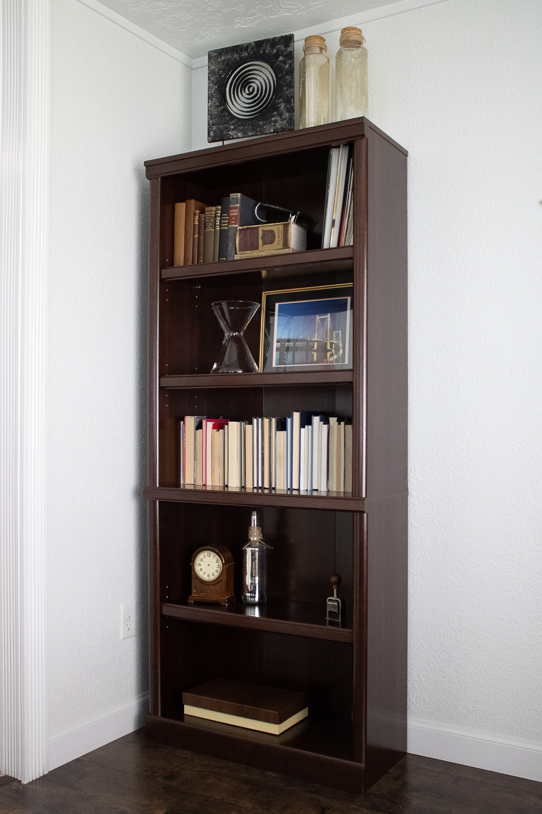
First, the office is located adjacent to the living room, which also serves as the family room. The previous furniture was literally a 'home office' kit with a desk, file cabinets, and bookshelf. Yes, it was functional (for one person) but was not taking full advantage of the tight space. The bookshelf really had no purpose. It mostly collected dust and many outdated nicknacks. I was more than happy to sell everything on Facebook Marketplace to start with a fresh canvas.
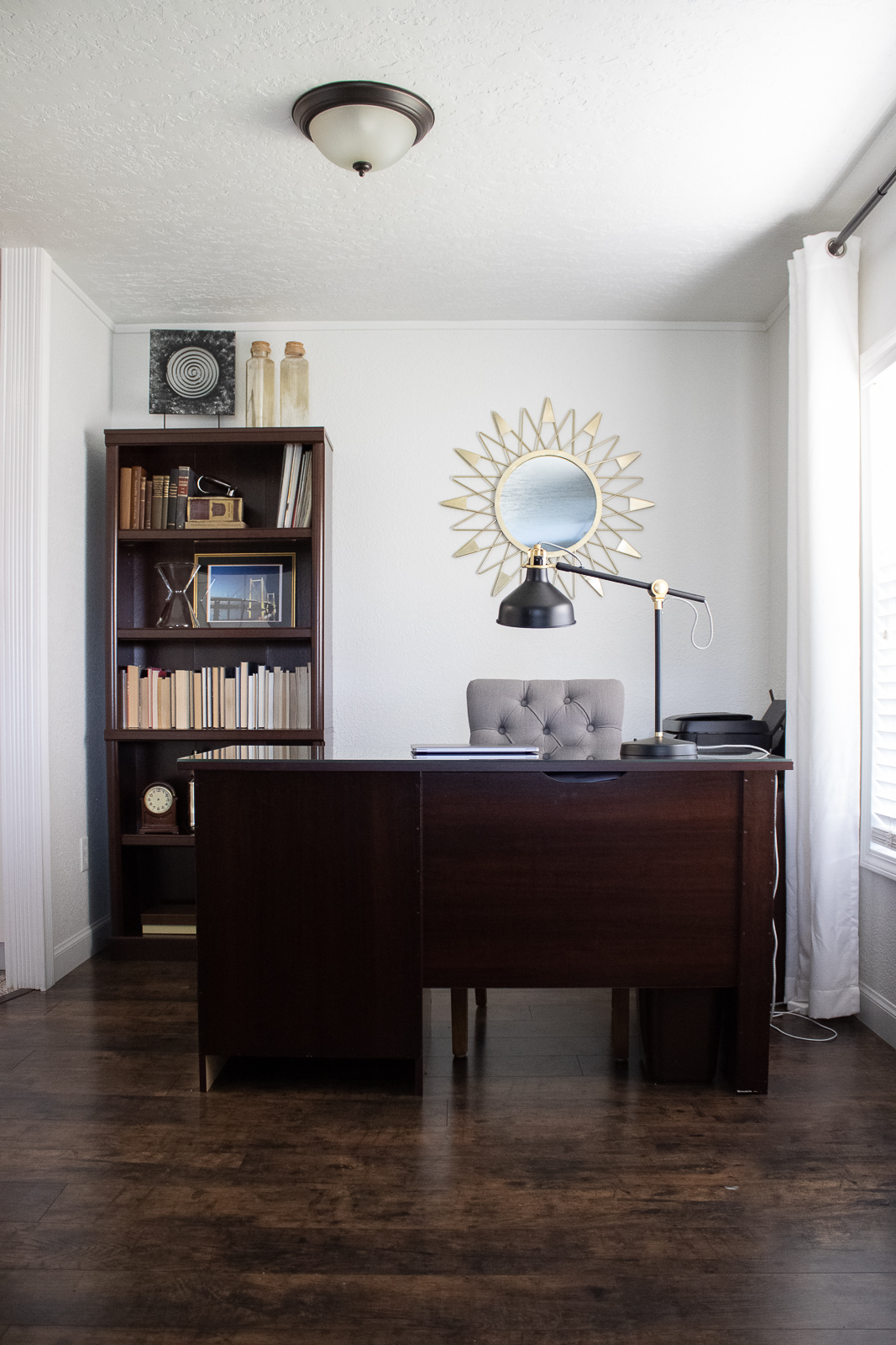
Second, the space could only accommodate one person at a time. This was a problem because it did not fit the kids (siblings) at once when needed. (Side note: Right now I live with my family and my siblings are 11 + 15. They have their own workspace to do school from home. Sometimes we like to work together because we motivate each other and the dining room is just not it for us)
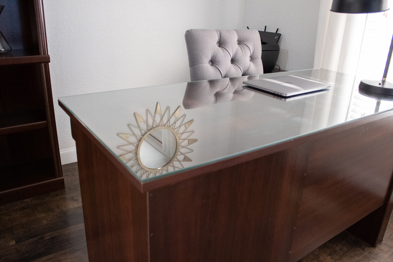
As I mentioned, the office is located adjacent to the living room and is always in view. This means that it is on 'display' and it needs to be presentable. No piles of papers, printers, routers, or unsightly office chairs.
THE AFTER:
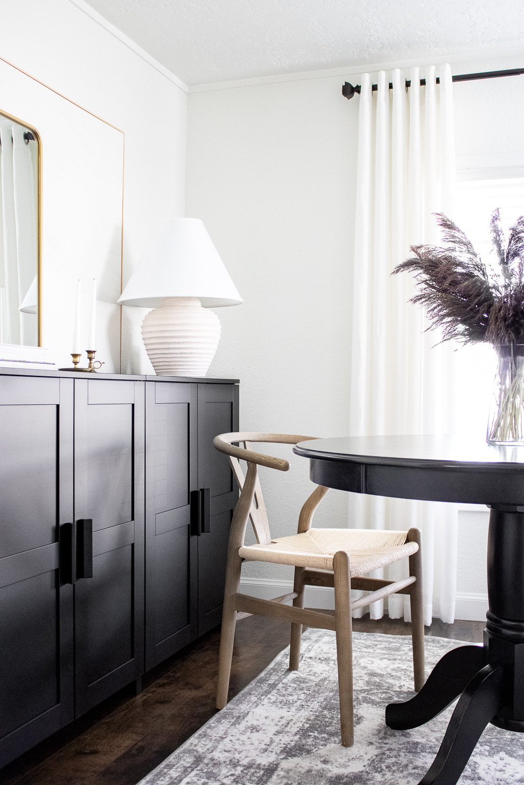
The first thing on my list was adding cabinets for storage. I originally considered doing another round of built-ins, but the living room already has some and it would be too much. I opted for some Brimnes cabinets from Ikea. They are simple and fit the transitional style of the home really well. Plus, they allow for ample storage. The printer fits just right too!
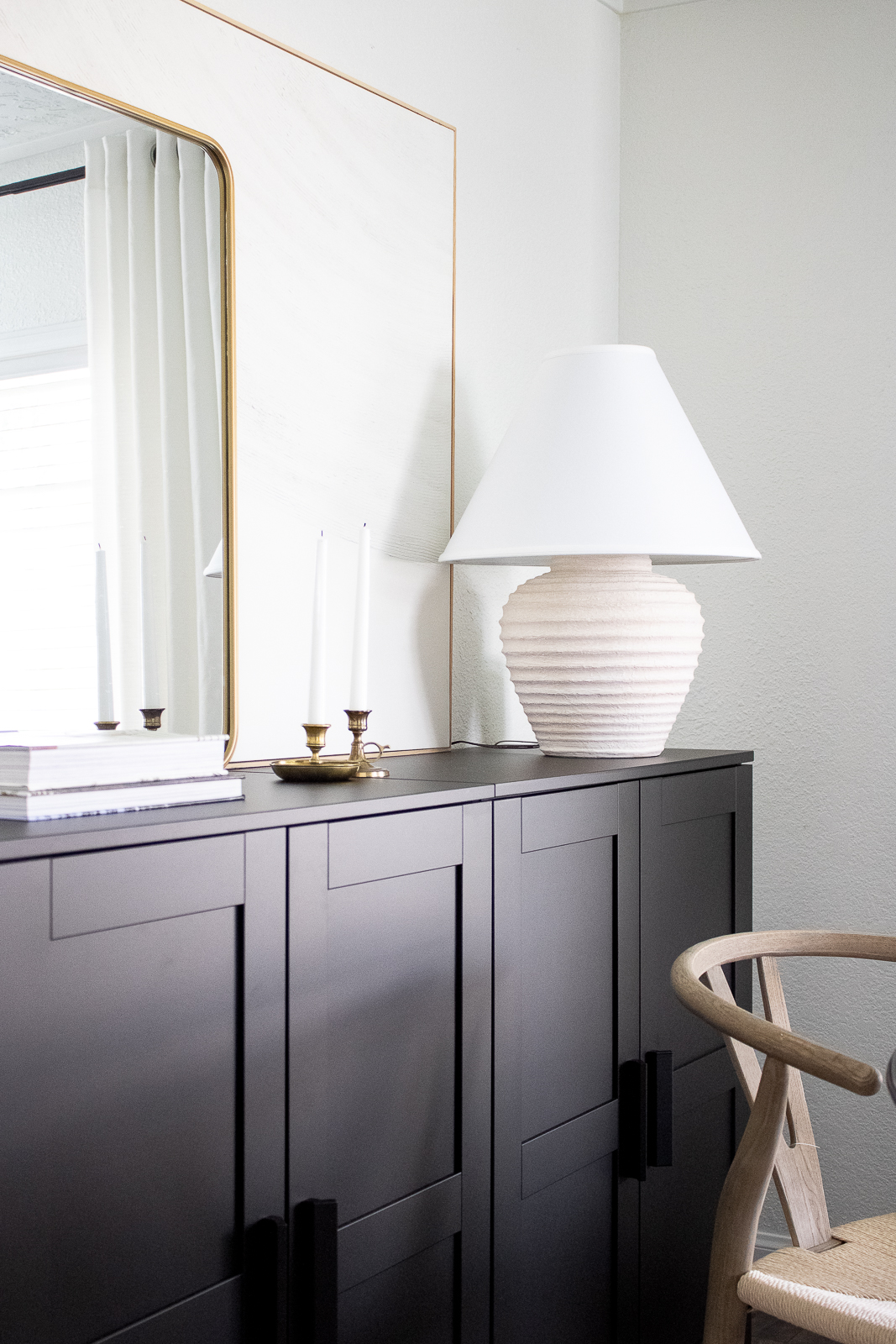
Unlike a bookshelf, I have found cabinets to be essential for keeping things clear. We're not big readers in this house so there is no need for many shelves.
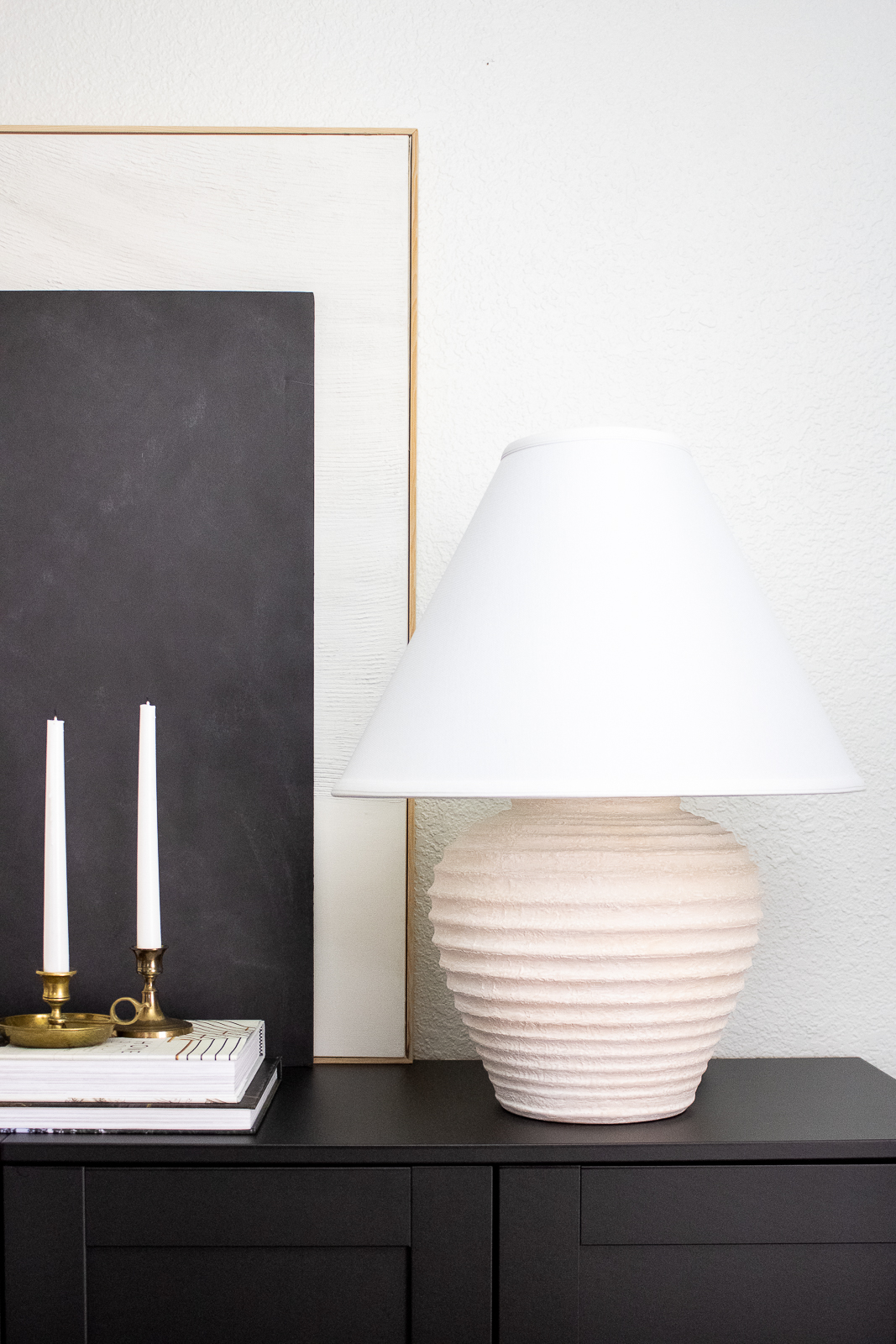
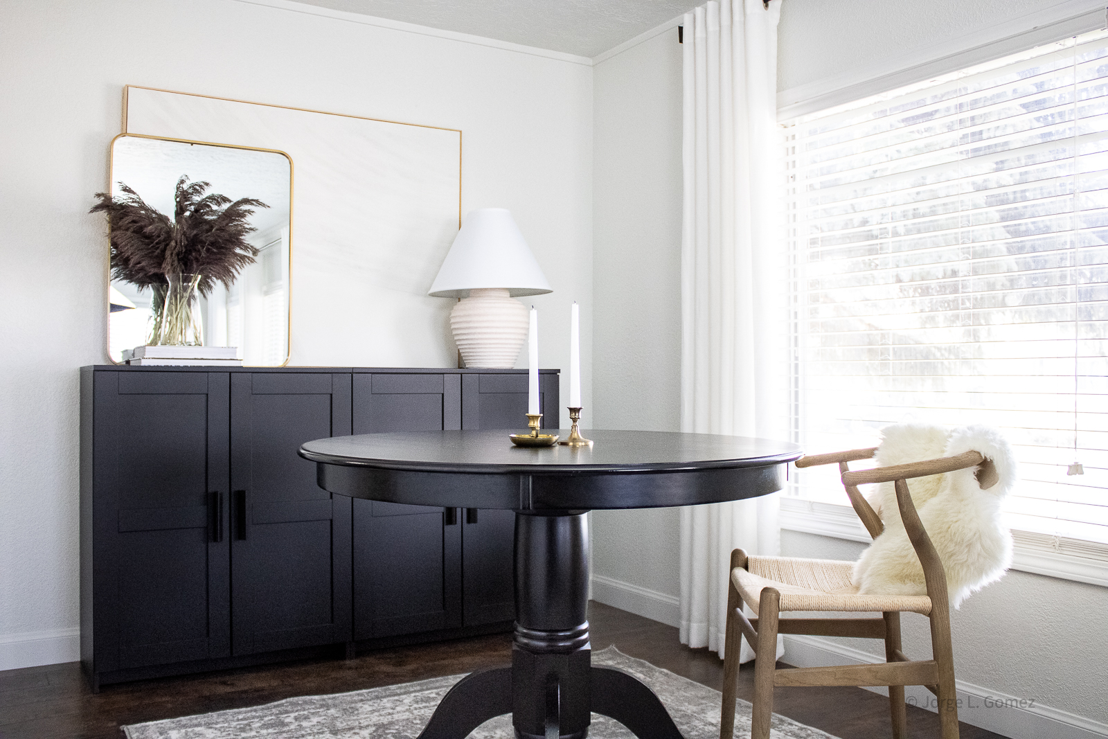
Let's talk about the elephant in the room: the desk. Some may say this is a round dining table, and they are correct. I find a round table is much more collaborative, is great for saving space, and is honestly more interesting than a typical desk.
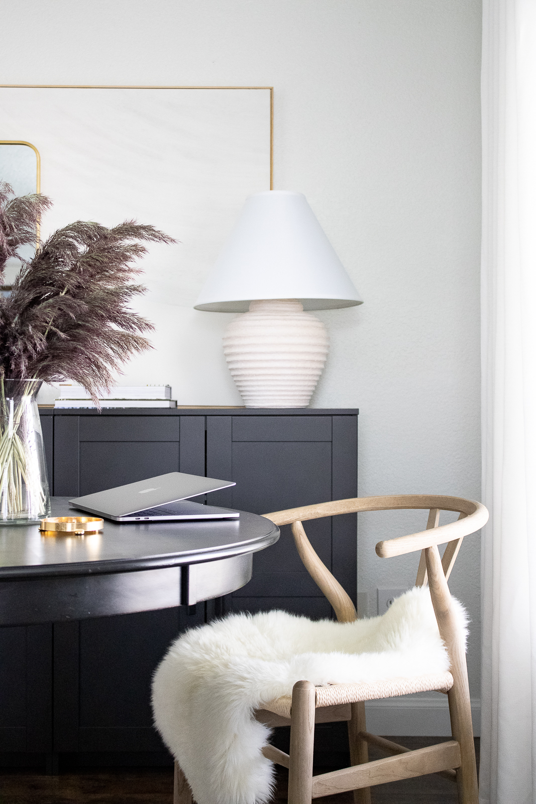
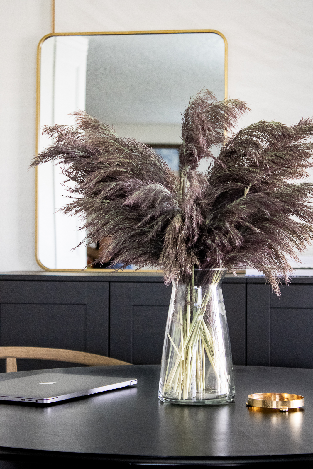
Remember that this office is seen from the living room (rug not shown). Less is more here! Pairing a lightwood wishbone chair keeps it minimal and creates an interesting vignette. Yes, it is comfortable to work in.
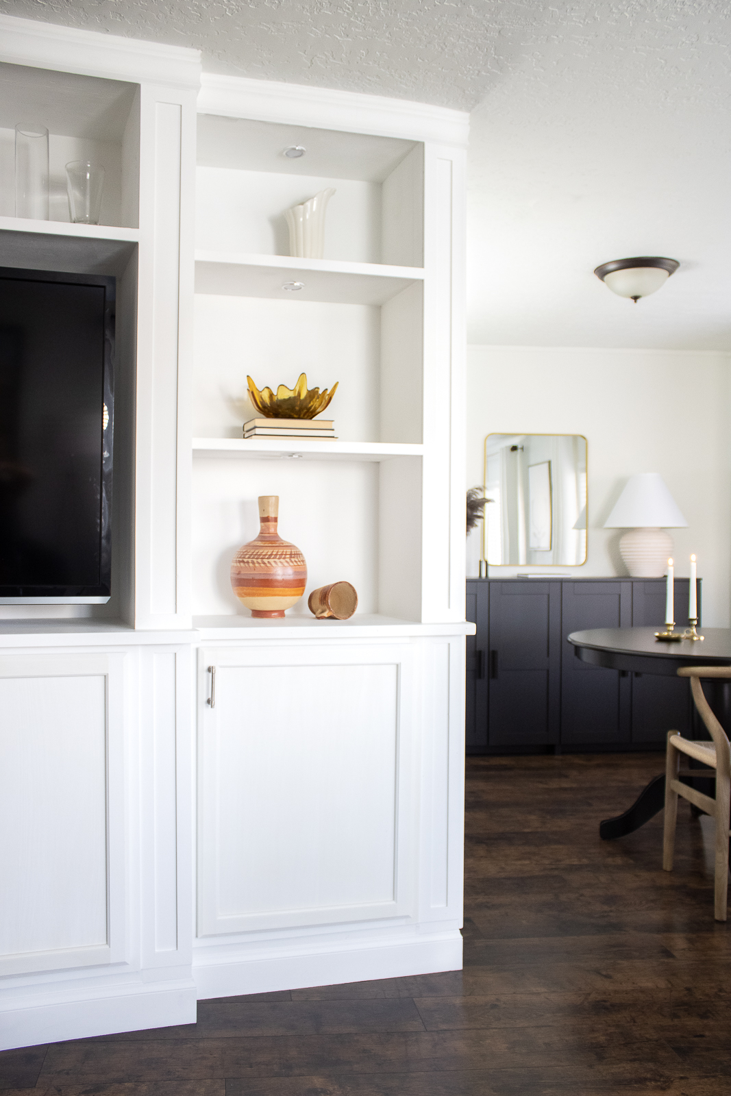
These days most of our gadgets are wireless and sleek. They can be stowed away very easily. At the end of the day all evidence of the office gets put away in the cabinet. It's all about keeping the space visually clear but still functional. There's even room for my office assistant (Google Speaker but some may use Echo) to sit out. Do you see it? It's behind the lamp!
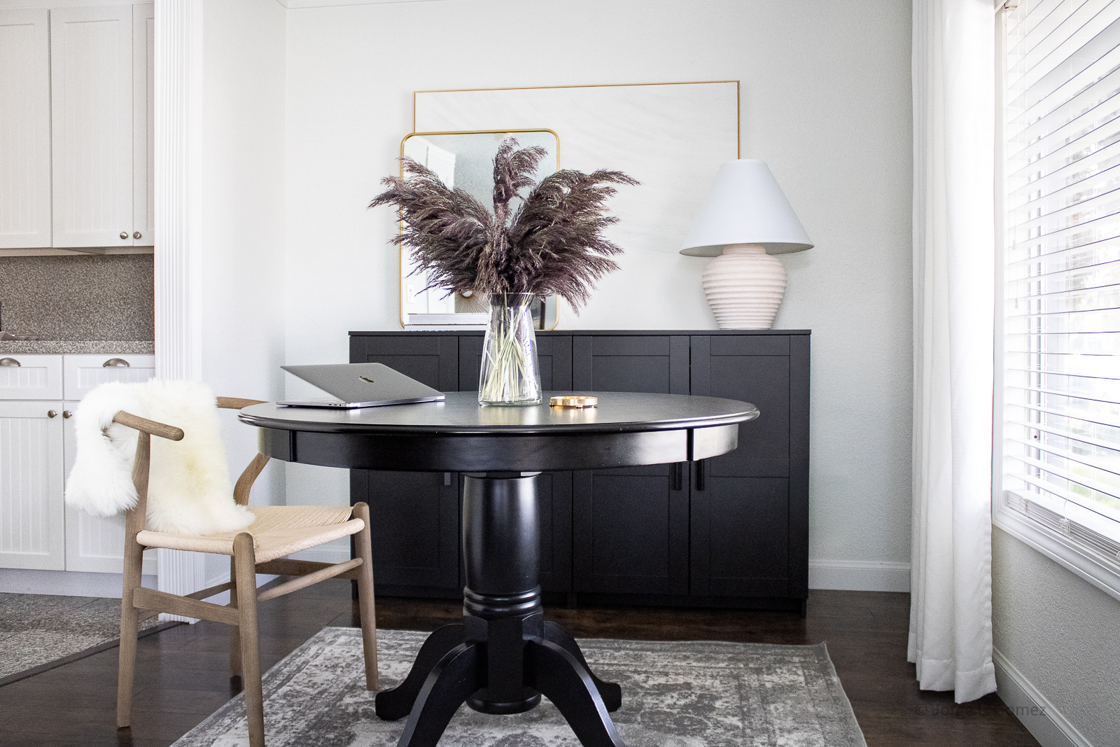
Contrast plays a big role for this room. It consists of black and white with some warm wood and brass. I left the curtains as-is because they still worked at keeping it minimal. A grey persian-style rug helps ground the space. Texture is added with the grass and a custom painting done by yours truly (learn how to make it here).

Final thoughts: Our workspaces at home should be functional but also motivating. For many that includes a simple palette. Overall I am very satisfied with the home office. This is where I spend most of my time in, collect inspiration, and get things DONE!
Thank you and I hope you enjoyed this makeover. Let me know what you think down below! Also, what is your home office situation like right now?
Get The Look:
Here are product links in case you want to shop the look:
Wall Color - High Reflective White, Sherwin Williams
Lamp (similar )
Looking for more links? Check out Shop My Home
Leave a Reply